House Update
My
looks like a bomb hit it. Construction is moving along, and important decisions are being made somewhat on the fly. Let me walk you through it.
When you first walked in the door, you were looking at a wall that was the kitchen (behind it) on the left, and living room on the right.
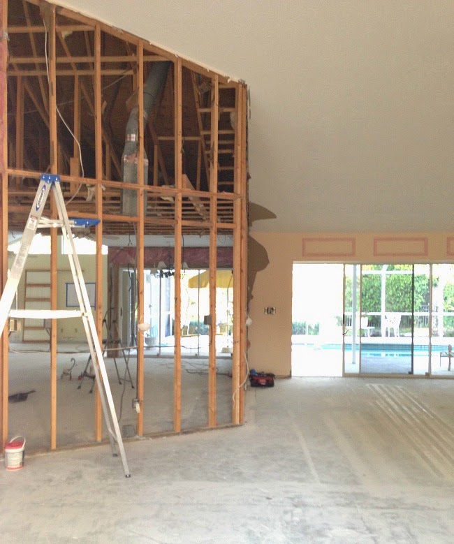
One structural engineer consultation, and the wall was removed. So much better.
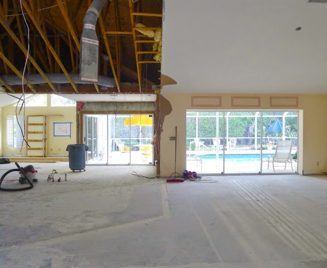
Scaffolding to reroute a/c and electrical.
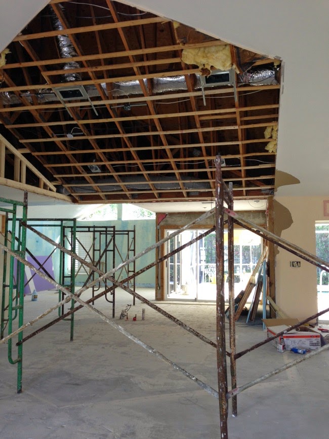
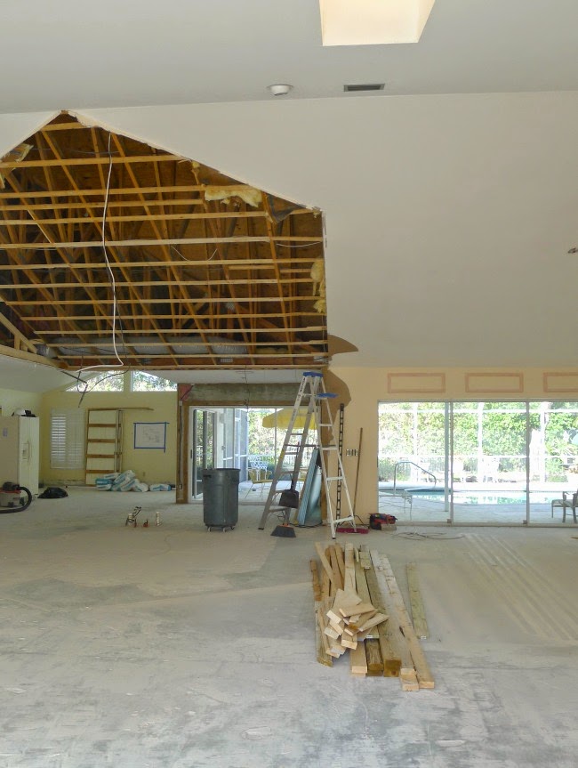
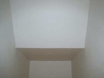
This is were the important decisions need to made. My architect recommended that we reframe the ceiling so that there will be symmetry in the new living room (on the left). That would require the ceiling near the front door (skylight) to be lowered to an eight foot height, and made flat. I love the feeling of vaulted ceilings when I enter the front door.
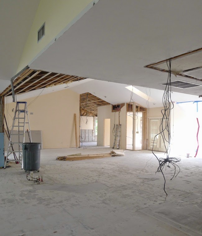
The temporary sink is approximately the center of my new kitchen. As you can see, the highest point in the existing ceiling won't be centered.....do I care? Will it bother me? Do I really want to lower it?
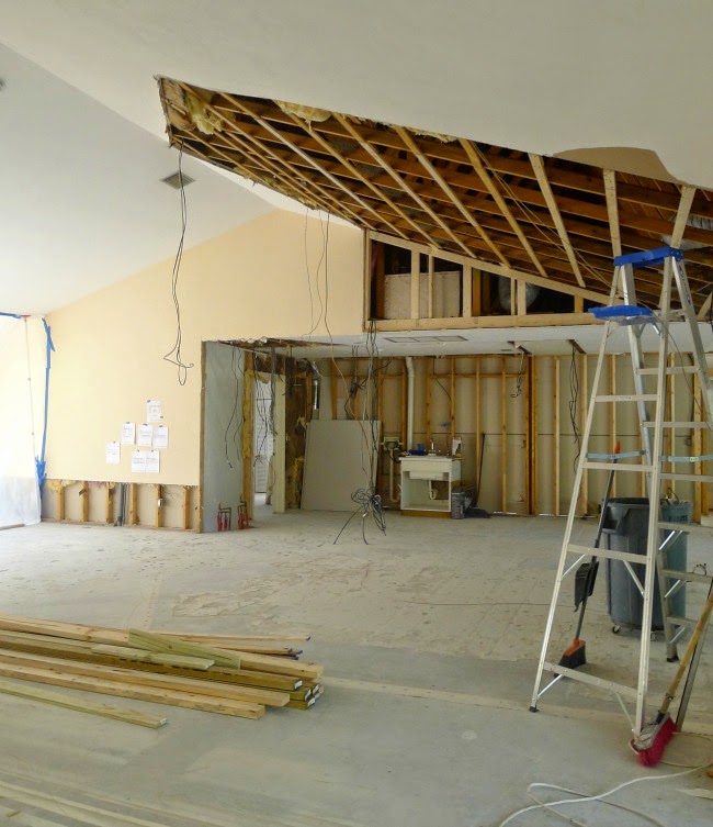
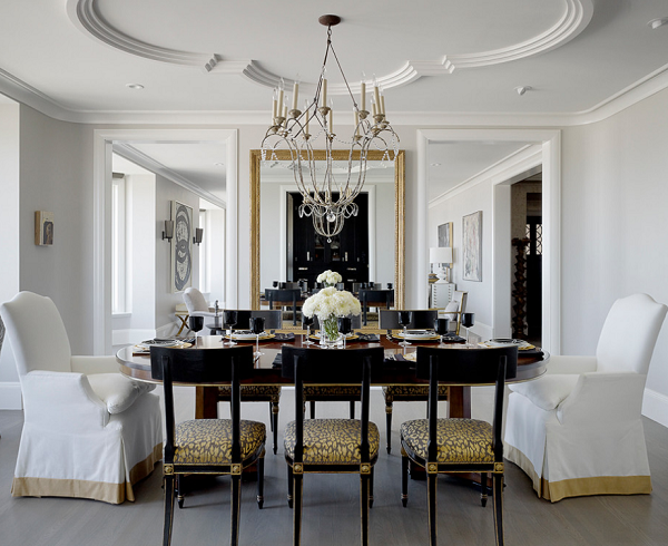
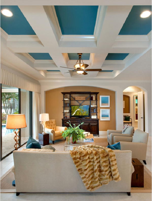
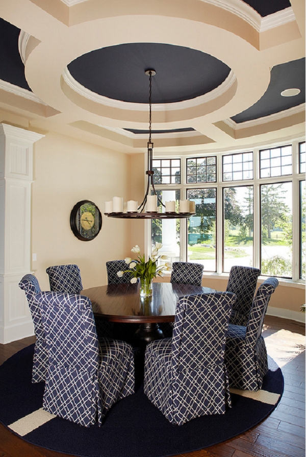
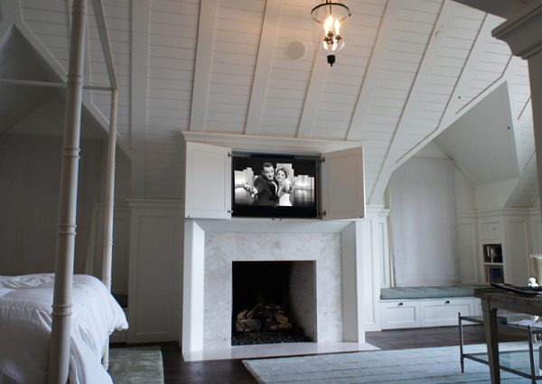
Like most design decisions, I turned to the internet for inspiration. All I needed were a few great images with off-centered ceilings to confirm keeping it this way. You cannot believe how difficult it was to find rooms....of any kind.....as in.....impossible. And then, I realized I was spelling asymmetrical wrong. Two 'M's' in symmetrical? Since when?
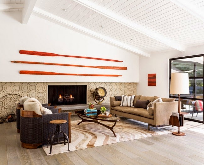

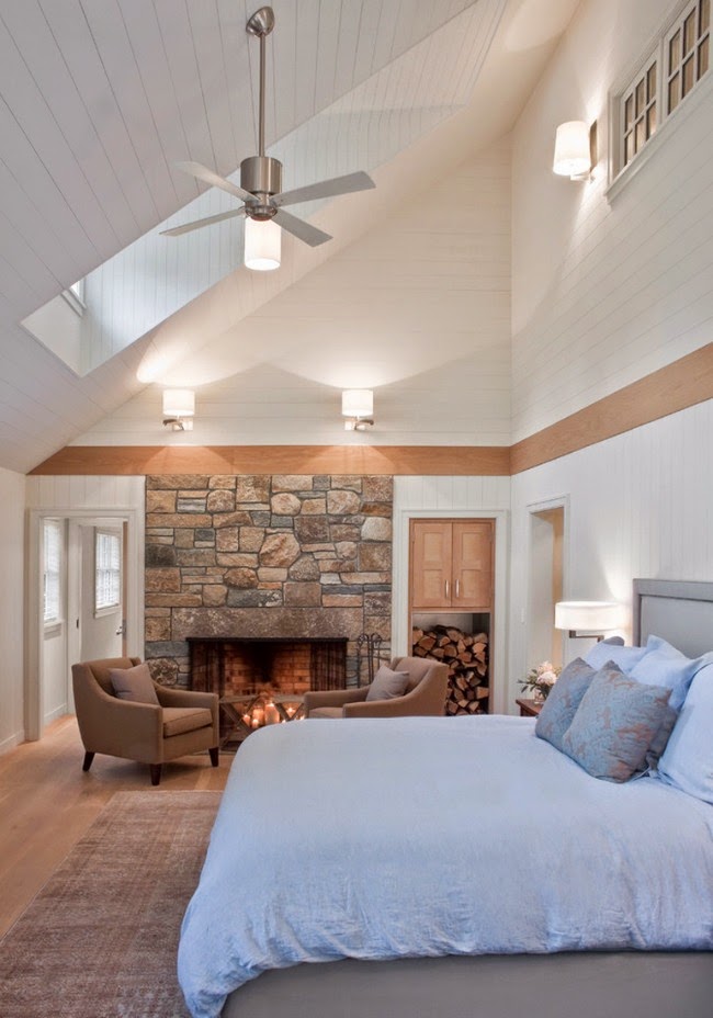
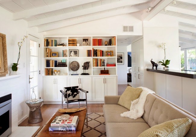
Feldman Architects
I think I'm going to keep the taller ceiling and live with the asymmetry. What would you do?


Looking Up
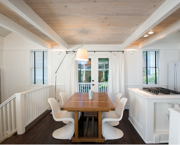 |
| Ed Ritger Photography |
 |
| dlc corp |
 |
| Julians Interiors |
 |
| Halsma Design |
 |
| source |
 |
| BHG |
One Room Challenge (week 4)
This is week 4 of the One Room Challenge. In case you are new here, you can start the challenge series here. The weeks continue to fly by. It is definitely time to prioritize and let the small things fall off the list. Here is the progress in my dining room
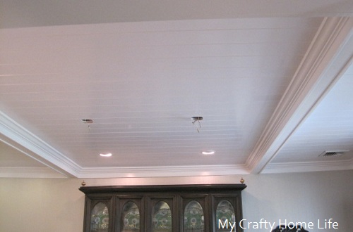
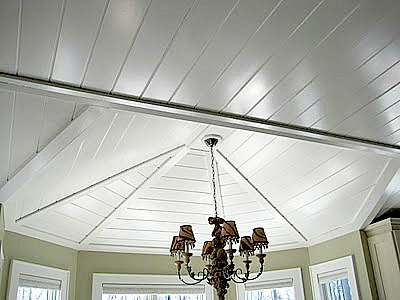
My ceiling is finished
If you would like to know how I installed the planks, you can go here. Now remember, the final coat of paint was applied by a professional painter...and well worth it!
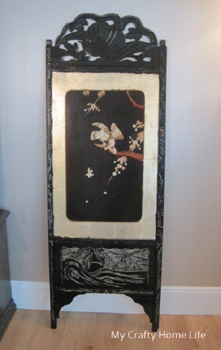
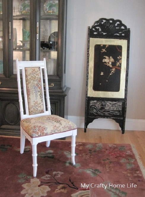
Remember this screen I showed you
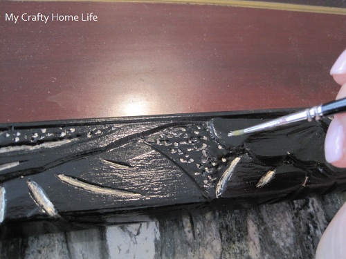
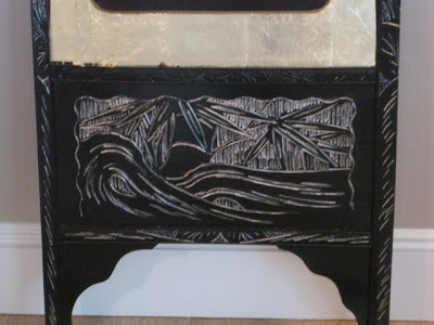
Well, I decided to deck it out a bit. First, I primed the black frame and then applied a high gloss finish. Once that was dry, I decided to add gold highlights to the carvings
This became so tedious, I hired my daughter to finish it. She still has more to do.
I also applied gold leaf. It still needs touching up and the missing pieces have not been put back...but you get the idea
I also separated the two and will hang them on both sides of the china hutch as artwork.
There is progress in my corner,
It now looks like this
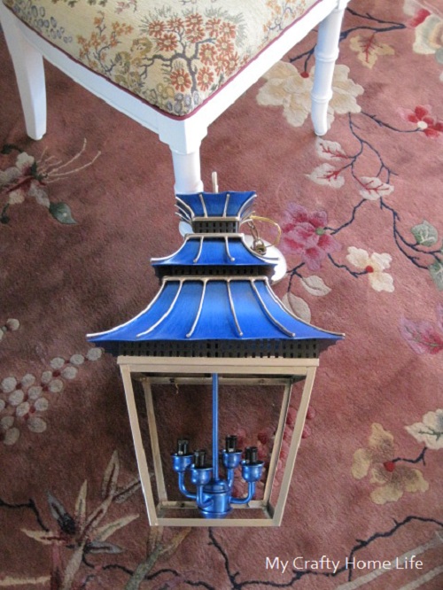
Speaking of lanterns, I have run out of blue paint and am waiting for Michaels to get a delivery. So, I can't hang them...but here is a better look at them
I am not sure if they need a black glaze on them to tone them down. I need to see them in place before I can decide that. This is the direction my room is headed
I had no idea when I started that it would evolve into this...but I think I love it! Thanks for checking in with my room, now let's go make the rounds to the other rooms and see how they are doing. For week 5 go here.
Saved By Suzy Nicole Scott Designs
Dutch.British.Love Kim Macumber Interiors
Trapped in North Jersey Rue de Emily
The Pink Pagoda refreshed designs
Nana Moon Shop Taylor Morgan
insideways House Four
Living Savvy (A Lifestyle Thing)
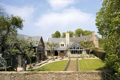
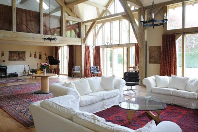
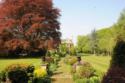
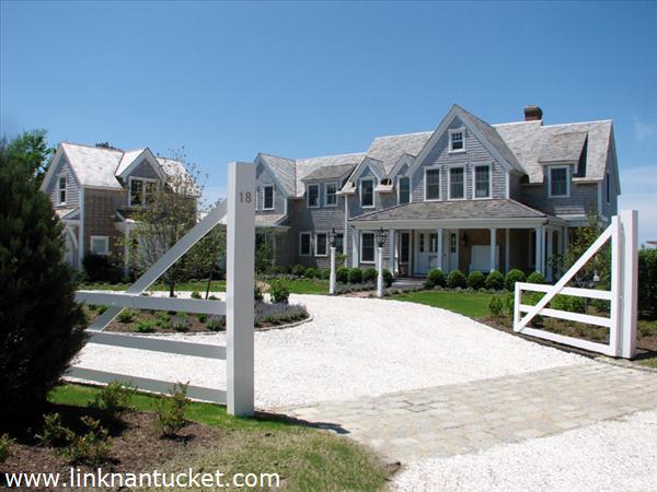
House Hunting in Cotswold, ENGLAND
I'm not sure if the hens come with the place? Since I am not ready to make an offer, no worries! Did you catch some good ideas to copy?
Which would you choose?
Another area for lounging
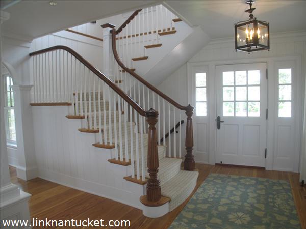
Custom moldings and trim-work that make my eyes water
An all white foyer....
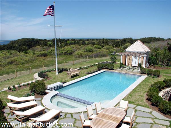
A perfect pool with stunning views
How to install V-Groove Paneling (beadboard)(plank)
I decided to give my basement entry the same treatment.
Here is the "before"
B-O-R-I-N-G...and a bit depressing. It was also too dark.
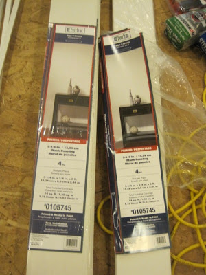
So, I purchased this
Packages of MDF V-Groove Plank Paneling. They are 8' long and over 5" wide. Since it is Tongue-and-groove, it will go together easily.
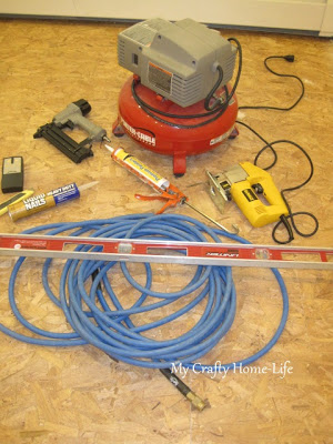
My tools
First, decide where you want to start. I started in the most noticeable place. The first few rows are the straightest. Hide the imperfections of your walls or ceiling in areas that are not in your common sight line.
Next, decide how you want to handle corners, starting places and stopping points. This is where I used the MDF trim.
For a modern take, I decided to run the planks horizontally. Here is what I did
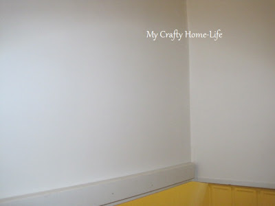
Attach the 1x2 trim to the wall
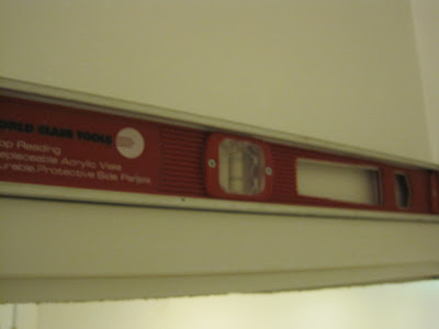
using a level, make sure it is perfectly straight
Now you are ready for your first board
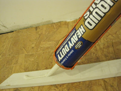
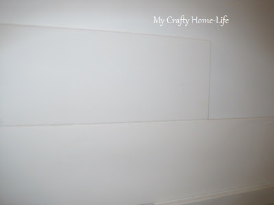
adding glue to the back of every board, place the board on top of the 1x2
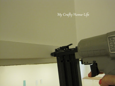
check for level, and nail. Let the glue do most of the work, don't over-nail. This will save you time in puttying.
continue
Here is how I handled the unusual angles
draw a level line on the wall (notice handrail on right)
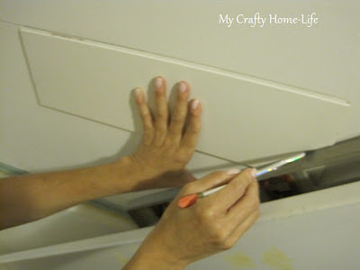
hold a scrap piece of plank up to the line. with a straight edge resting along the angle (handrail)
draw the angle. Make the practice cut, and test. When you are happy with the cut, use the real plank for the final cut.
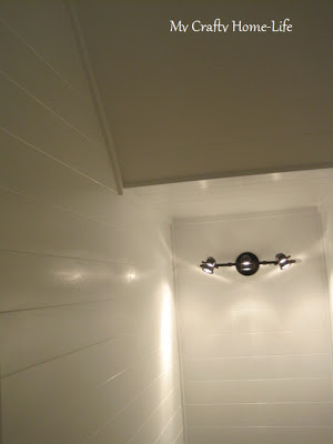
Another look at the "before" & "after"
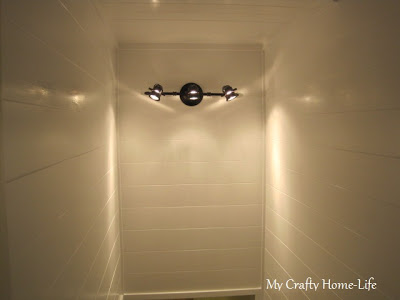
Oh yeah, I added a light fixture too! I think my dining room is next.
What are you working on?


