Linda {Calling it Home} Linda {Calling it Home}

My Master Bath

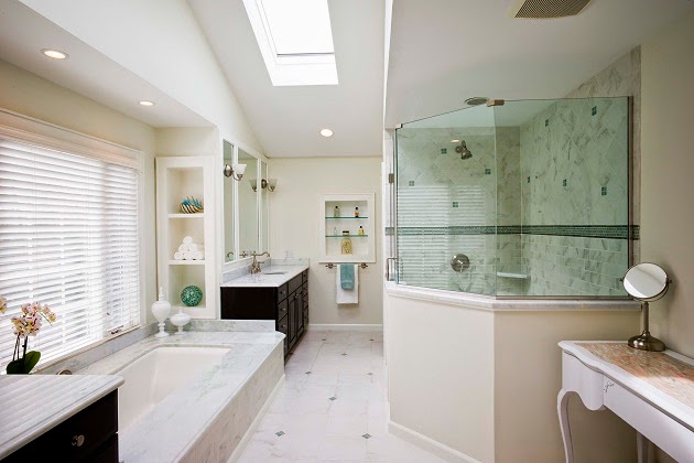
I thought it would be fun to share some other areas of my home with you. I love my master bath and will miss it. It may be the only room that I would still design exactly the same way. 


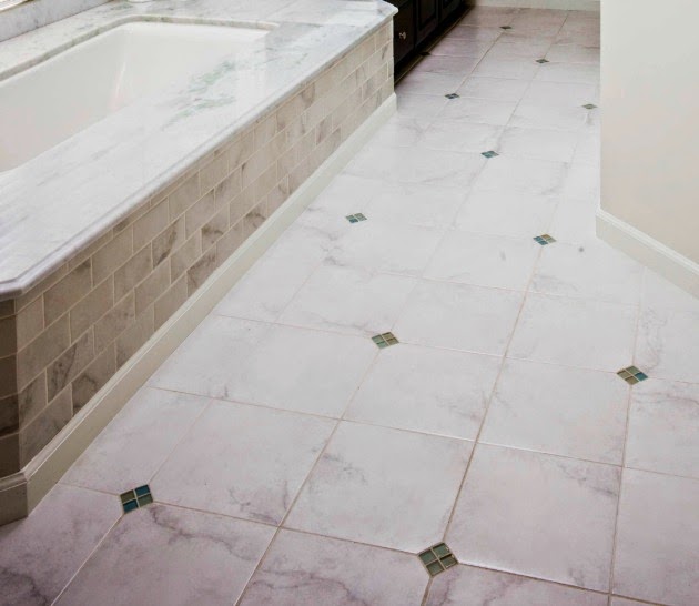
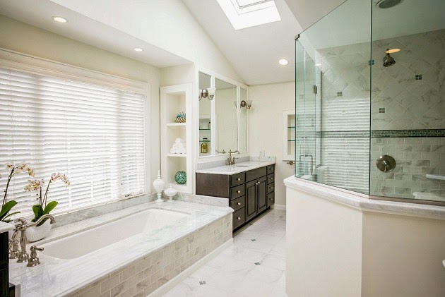
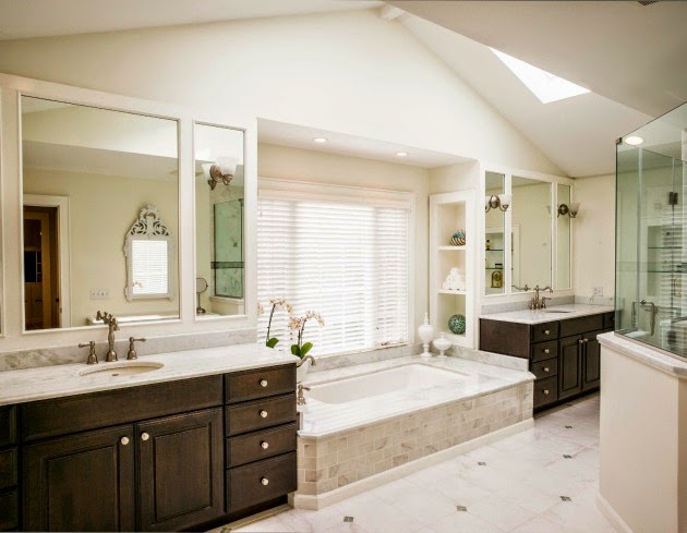
The floor is a porcelain tile made to look like Carrera marble. There are sea glass square tiles accented throughout the floor. The apron to the tub is Carrera marble cut into subway tiles. The top of the tub is white marble with a green sea glass color running through it. 


The tub is a deep soaking tub. You can see that the Carrera tiles are mixed for an interesting pattern in the shower, yet it does not command your attention. 


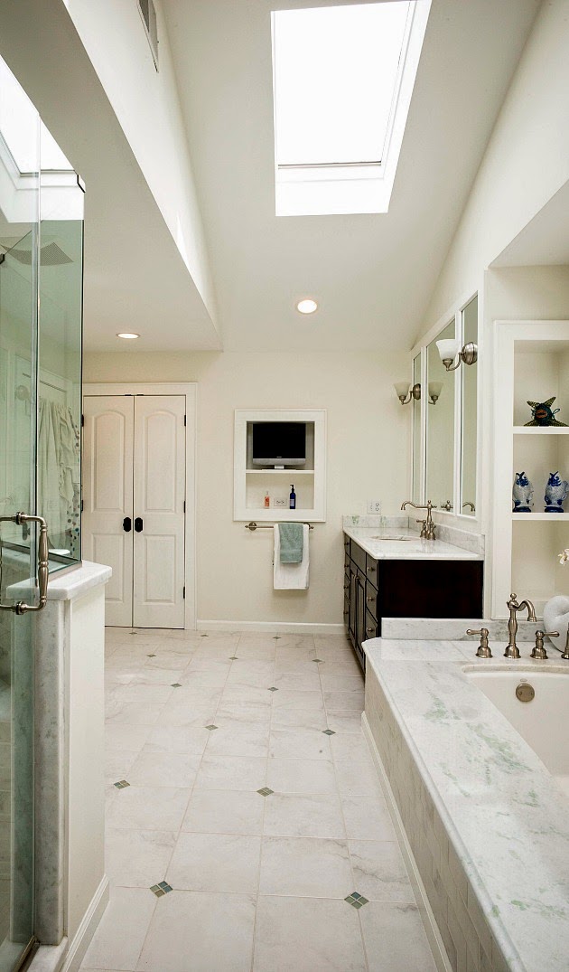
Looking back the other way shows the perfect view of the television from the tub. Go ahead, judge away....every night I soak in the tub while watching some sort of reality tv show. Oh, and I usually have a glass of wine. We definitely lived well in this home. 


Custom built-ins were added whenever possible. 


Double vanities are definitely helpful for a long and happy marriage :). All the glass and mirrors have a green cast to them that plays off the green in the marble. I wanted the largest mirrors possible to help bounce the natural light around. I designed the three sections and had the sconces cut into the glass to break up the large square and keep it interesting. 


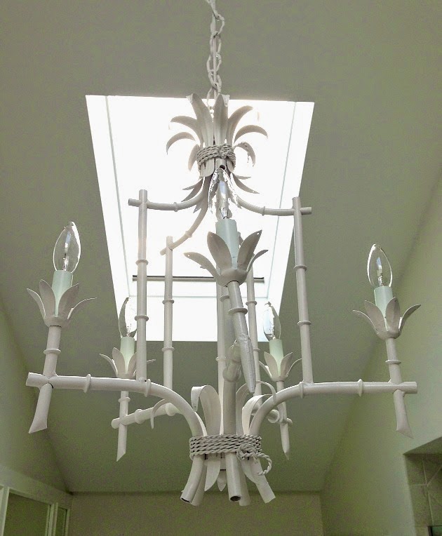
This chandelier will move with me. 


It will probably be a while before I have a bathroom like this one, again. Do you have a favorite spot in your home where you go to relax?


Read More
Linda {Calling it Home} Linda {Calling it Home}

My Consultation with SawdustGirl

I have been dying to work with Sandra @ SawdustGirl for the longest time. She is the amazing carpenter behind projects like this library.


Her skills are better than anyone I have ever had work in my home. 

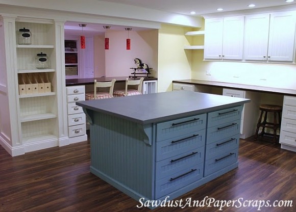
Here is the craft room she designed and built.


This isn't Ikea....it's all from scratch.

Sandra now does consultations via Skype. For a small fee you can chat with her and tell her how you envisioned your built-in's. After that, if you want to go further, you can hire her to draw up your plans. She will stay with you throughout the entire project.

Here's my next project.

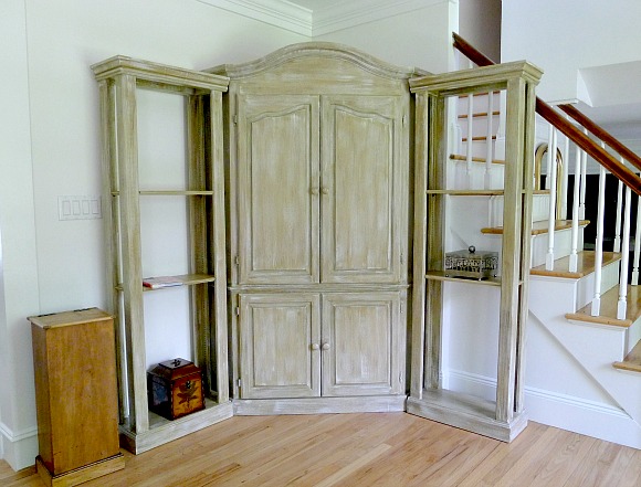
This is the opposite corner of my living room. The enormous armoire came from our last home. Remember when the tv was so big, you needed this to hide it? The shelves on the sides were made to fit our old space perfectly.

 I could just put a coat of paint on it, and call it a day. However, I think this space can be staged better and feel a lot more custom. I'm showing you how it really sits in this room. I never styled this because I never liked it here.

After a lot of questions and sharing my long term goals, we decided that bookshelves would be best for this space. 

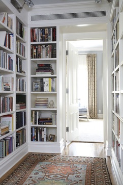
Something like this

CWB Architects
The plan for the room is to be more library, and less den.

I should have the bookshelf plans in about two weeks. I'll keep you posted.

Read More
Linda {Calling it Home} Linda {Calling it Home}

One Room Challenge...Week 6

Hello Friends. Today I am happy and I am sad. Happy that it is week 6 and I have a reveal for you. Sad, because I had the best time doing the One Room Challenge and will miss it....until next time! If you would like to start at the beginning...you can go here.

I want to thank Jennifer for designing the buttons we have all been using. I also want to thank her for some gorgeous prints. We are in negotiations on the price, and I will be telling you some secrets about her if I don't get a bill soon.


Now, I won't waste space typing...I'll just get to the part you want to see...PICTURES!

A quick review, it started like this


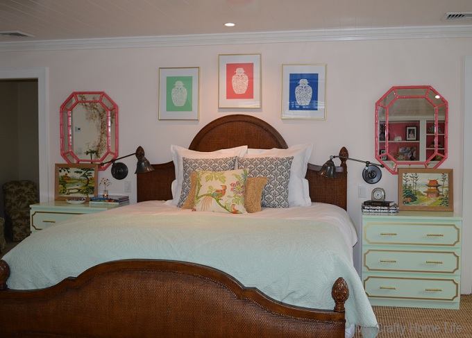
And now it looks like this


Do you recognize the pillow? 


It is the one I won from Everything LEB.

Remember this corner?


Now it looks like this


It started with the Ikea hacked built-ins


Uh, my babies when they were babies


close up on hardware


I didn't plan on doing a gallery wall, but after I pulled out all of my vintage paint by numbers...I thought it would look good as a grouping. You know how they say you can use craft paper...tape it to the wall...play with it...It DOESN'T work. You need to put 7 or 8 extra holes in the wall before you get it right....plan on it.


I framed the house portrait that Laura Trevey painted.


Remember this corner?


Now it looks like this


The wall hanging was another Ebay purchase. The other Ikea hack up close

 
The wide view (thanks Lisa)


And there is my rug on rug


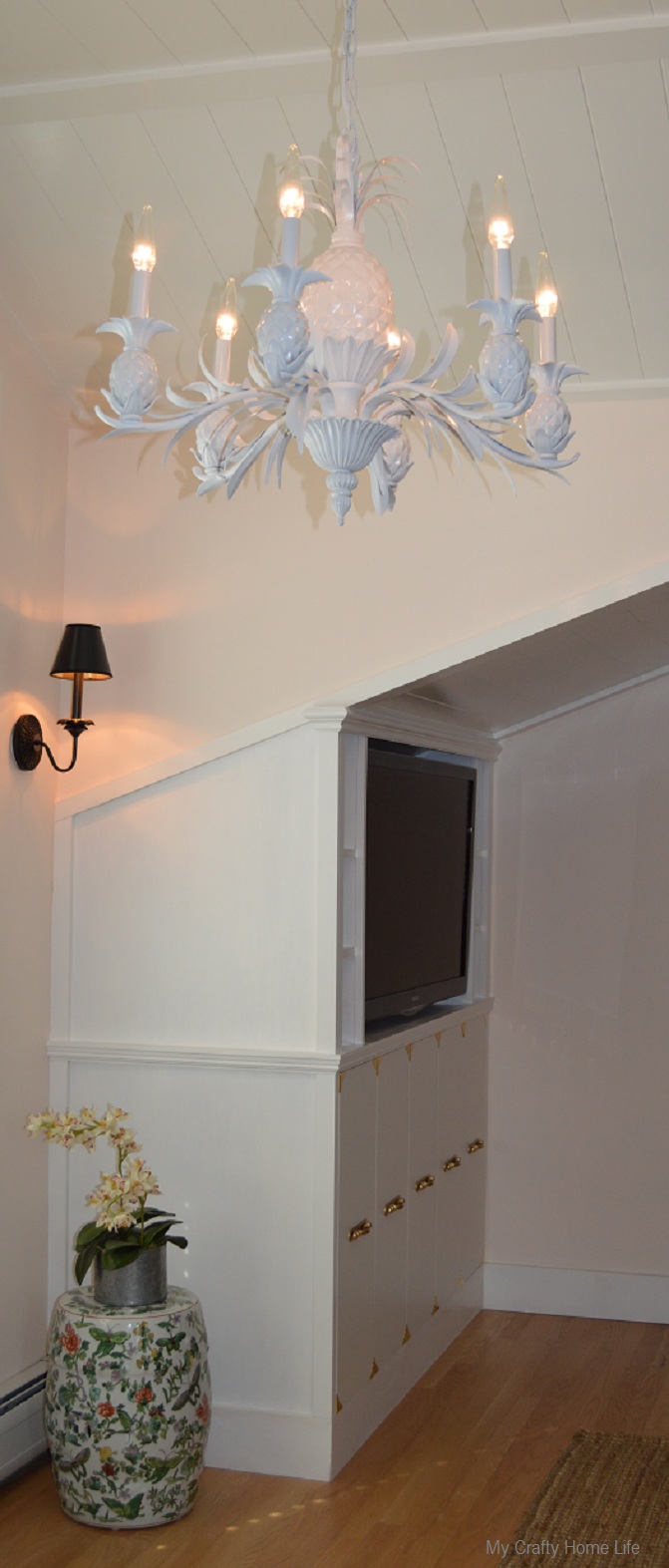
And here is the chandelier with those cool light bulbs Beth mentioned


A simple shade for the sconces


My parting view

Thank you for coming back week after week to check on my progress. Your kind words and comments kept me going. The room could use a few more touches, and probably some editing, so be sure to check back from time to time. Now,I am so excited to see how everyone else did...aren't you? Let's go see

                       Chinoiserie Chic                        Nana Moon      
                   The Cottage Mix                       Nicole Scott Designs                               
           Design Indulgence                    Pawleys Island Posh                          

    Everything LEB                            The Pink Pagoda                  
                       Hodge:Podge                           Powell Brower Home                                    
  Kim Macumber Interiors                 The Pursuit of Style                 
    Lisa Mende Design                      Rue de Emily                         
                 Living Savvy                                Sadie + Stella                                    
         Mix & Chic                            Trapped in North Jersey     

Read More