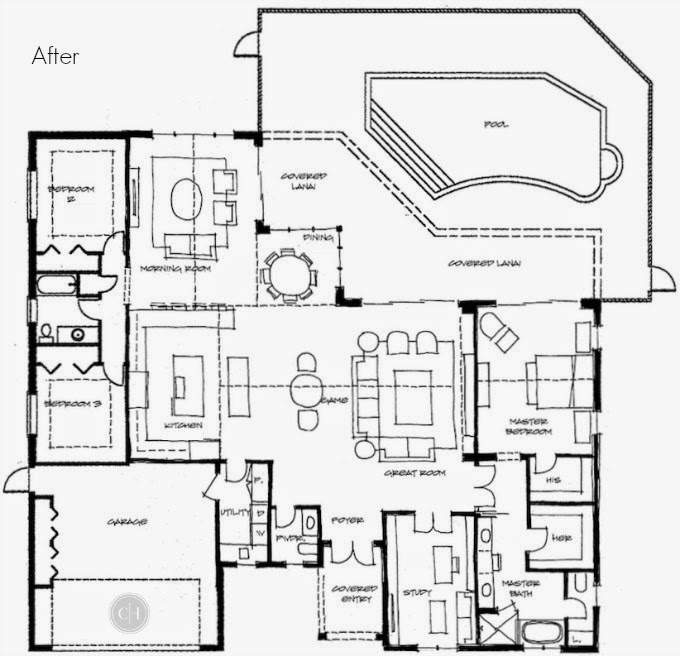
Here's the Plan
I just received the revised floorplan my architect created, and I can't wait to share it with you.
First, here is the before. You can see how the current kitchen location blocks the flow of the home. The study has an awkward entrance through the master bedroom, few strange angular walls, and no powder room.
Here is the plan. The laundry room moved, and made way for the kitchen. The dining room was eliminated, completely. A powder room was added, and the entrance to the study was reconfigured. The angles were squared off, and the master bedroom square footage was evenly distributed into something that made more sense.
I love this plan. It's exactly how I envisioned living in this home....only, I didn't know it. I wonder what will change when the reality of cost comes into play?


