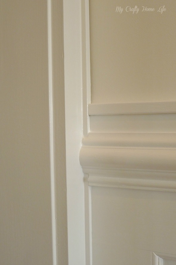
Vinny, my painter, just left. I have to say, there is no possible way this will look as good in pictures as it does in person. Unless of course you have a better camera than me, or just know how to time the natural light thing. No matter, I thought this would be a good time to tell you the specs of my One Room Challenge walls, just in case someone out there wants to do a wall treatment and doesn't want to nail a bunch of sizes up to the wall....like I did.
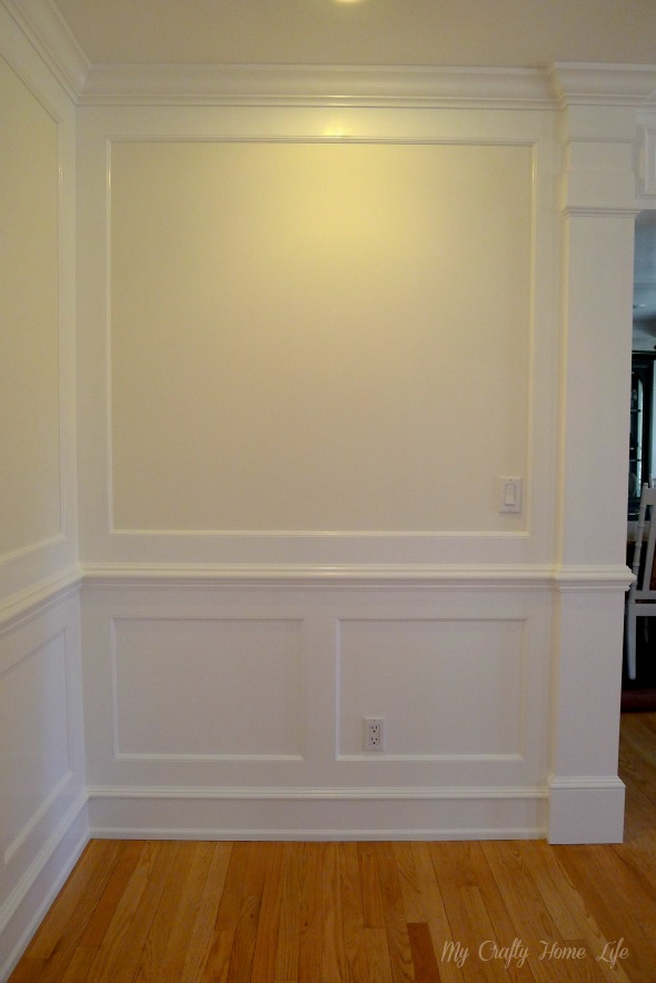
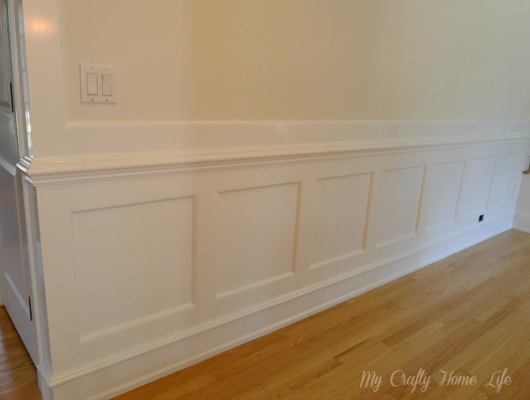
Here is what the walls look like in most of my entry.
The majority of the trim is 1/2" MDF sheets cut to specific widths. I like MDF because it doesn't move {shrink/swell} like real wood. I hate seeing those cracks in the joints during the winter months.
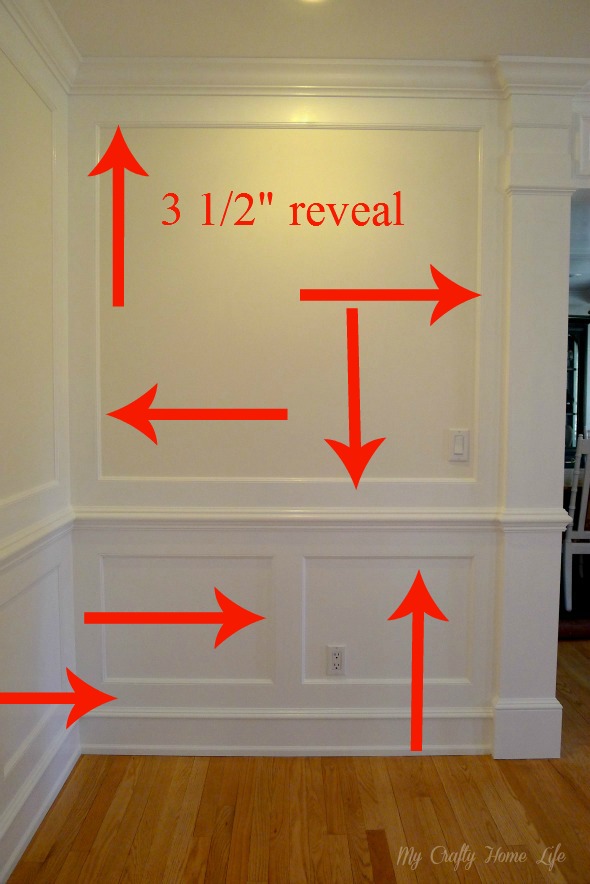
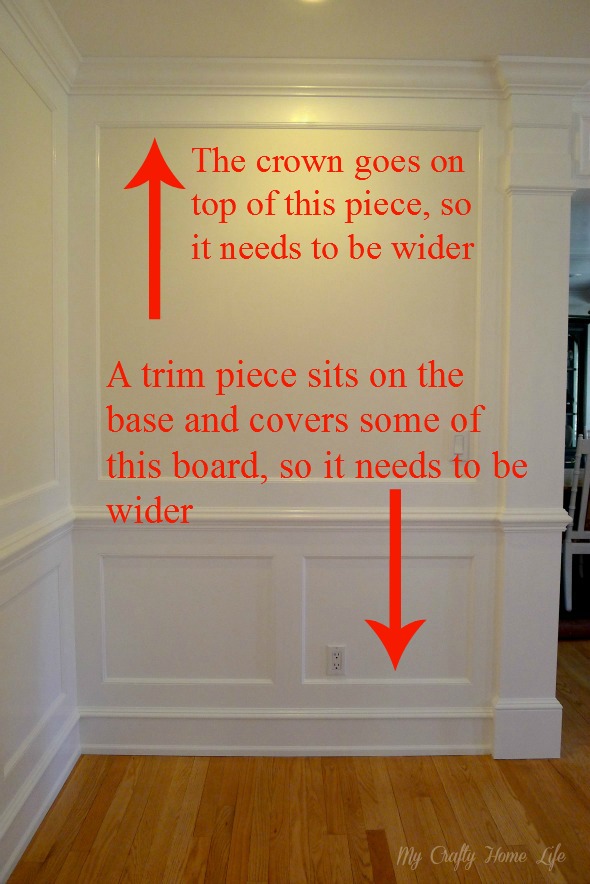
Here you can see the reveal I used...3 1/2". Since that is the reveal, many of the boards needed to be wider.
This will show you why
Maintaining a consistent reveal throughout will give you a really expensive looking project.
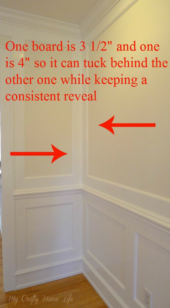
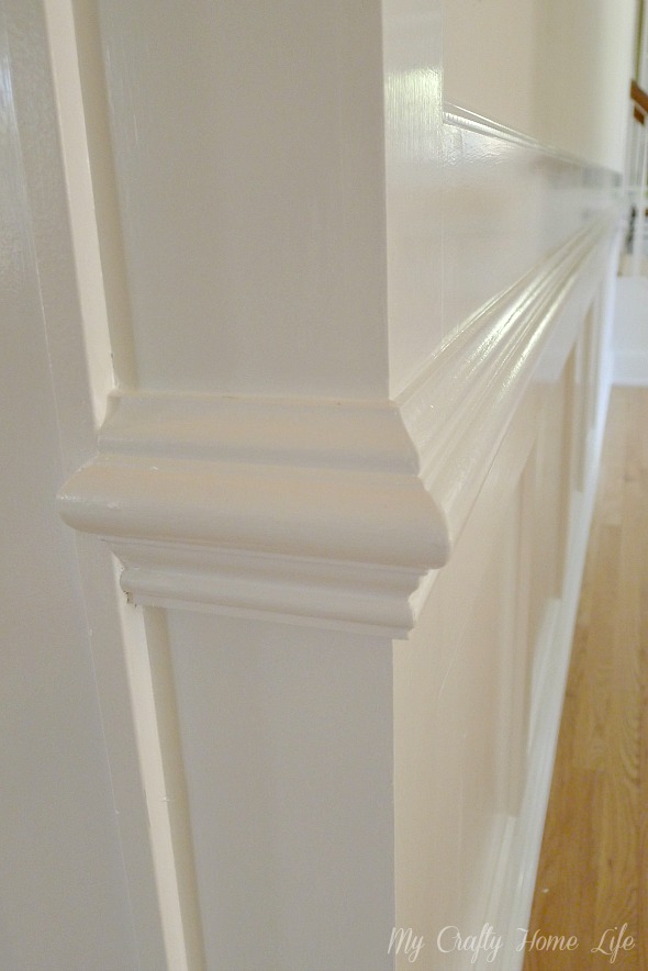
Another thing to consider is the corners
On an outside corner, you would need to take 1/2" off one of the boards.
As for the panel widths, I would suggest that you divide the wall into a size that you feel comfortable with. Since every one of my walls were a different length, they are similar to each other, but far from exact.
Furniture placement will camouflage a lot of this.
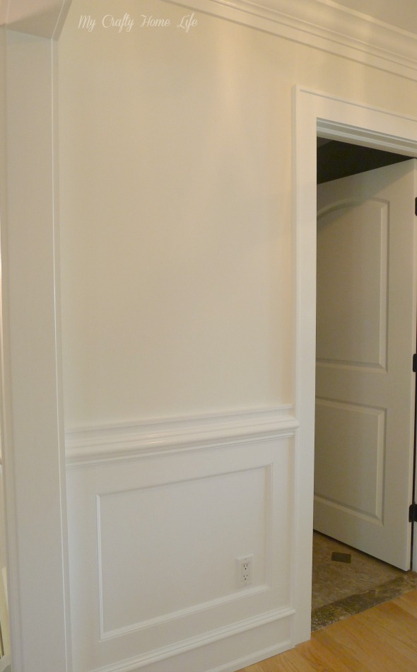
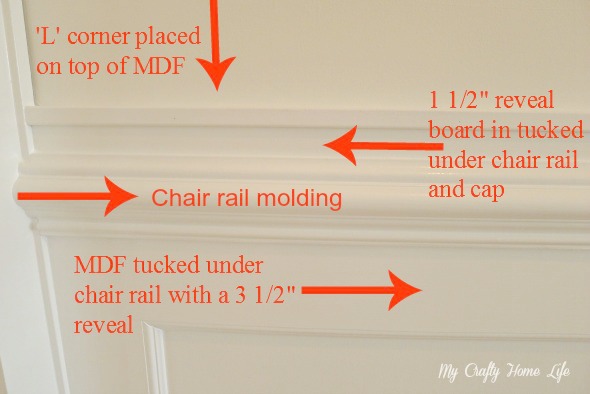
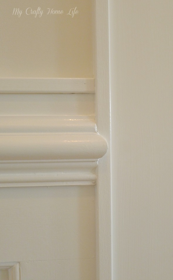
In this small area that I called Section 2, you can see that a framed upper wall would not work. I kept the same bottom treatment as the other hall, but modified the top to be a mock chair rail. You can also notice that the reveal under the crown was modified, too.
Here are the specs for the top of section 2
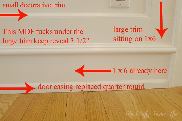
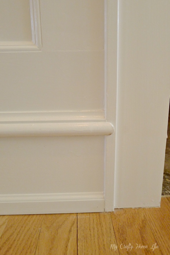
Here are the specs for all the the bottom pieces
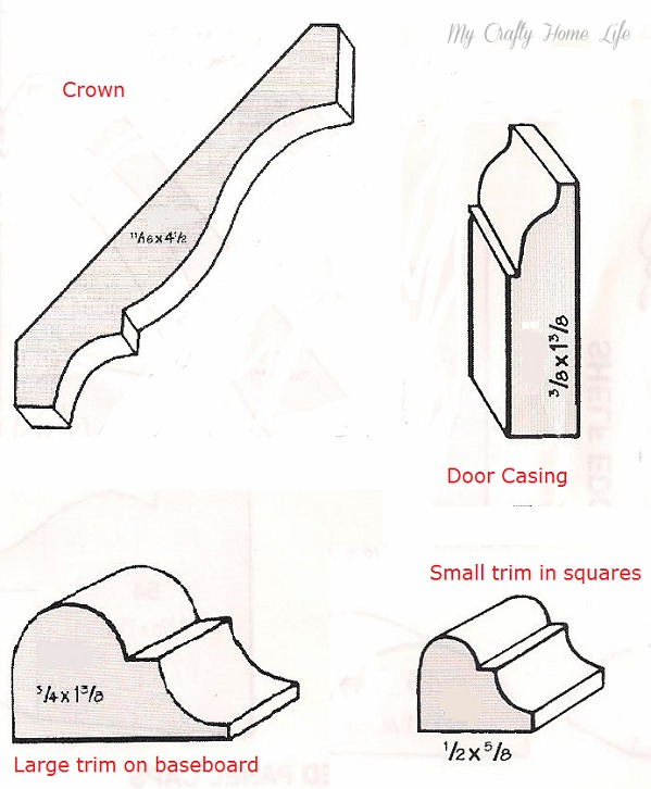
These are the trim pieces that I used
Some of the hard cuts that Joe and Mike did
Wrapped the corners
All of the trim is pained in BM Snowfall White. The walls are BM White Dove.
Do you have architectural moldings and trim in your home?
Week 5


